After celebrating 100 years of the NFHS, the organization took the opportunity to reflect on its past, present and future as the national leadership organization of high school athletics and activities. As state associations and students across the country continue to rely on the trusted resources, opportunities and guidance provided by NFHS, the start of the second century for the organization was the time to elevate the identity, perception of the brand and how it’s received moving forward by state associations, family members and students.
Design Objectives
Create an identity that honors the tradition of NFHS, with modern updates, which will be distinct and memorable.
Visually represent the NFHS as the national organization for high school sports and activities.
Tell the story of the NFHS brand with the introduction of the Play.Perform. Compete.Together tagline.
Brand Characteristics It is important that audiences continue to rely on the NFHS in the ways they always have, but to know the organization as one that is proactive, forward-thinking and relevant among each audience it serves.
The logo was built with the following brand characteristics in mind:
Enlightened
Sophisticated
Leader
Intelligent
Knowledgeable
Visionary
Insightful
Entrusted
Caring
Responsible
In touch
The NFHS Logo
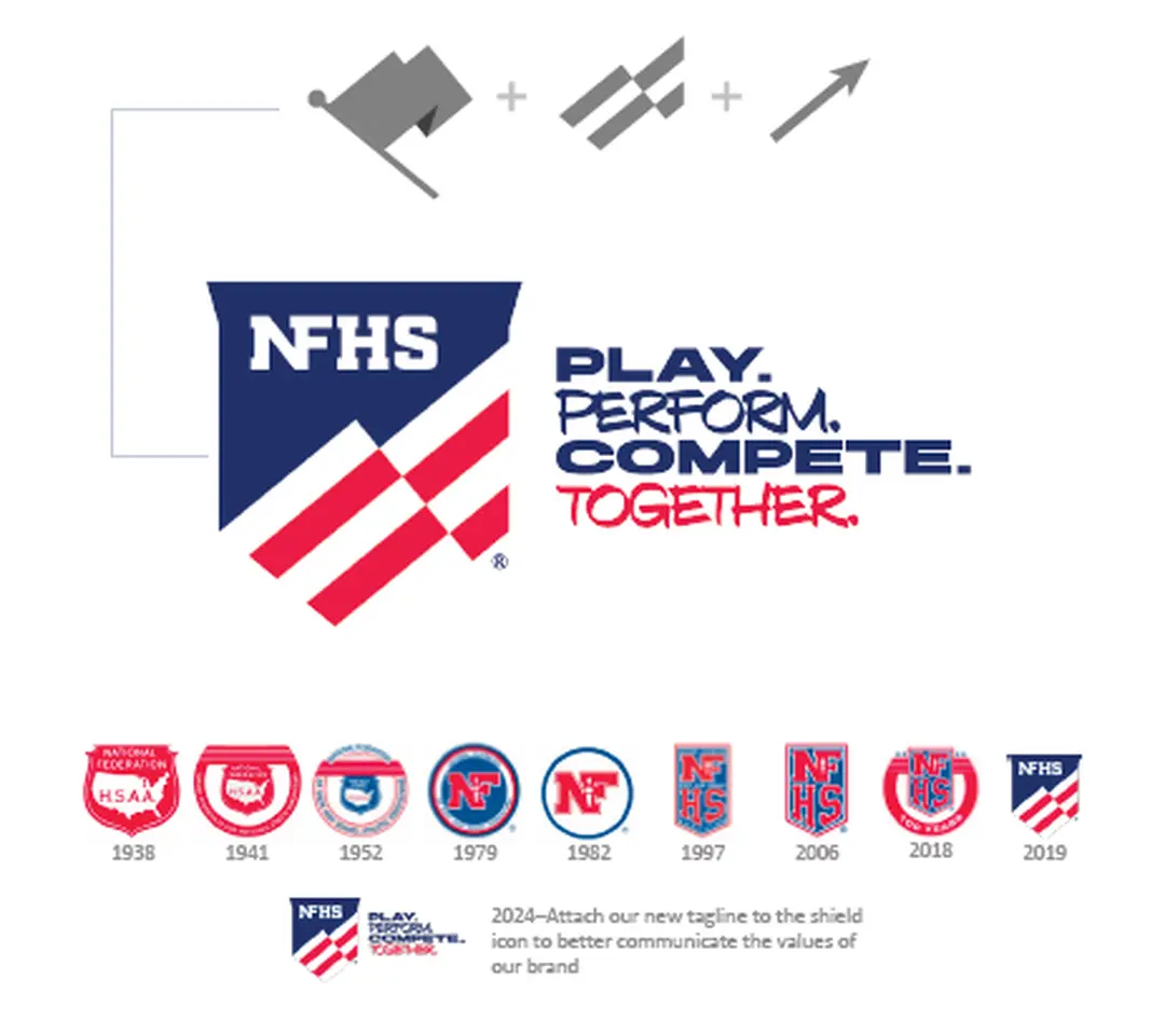
The ‘shield’ is an evolution of past logos allowing the mark to connect with the organization’s first 100 years and bridge into its future.
Flag element creates strong national symbolism.
The four stripes within the flag element represent the four locations of the national office.
Direction of flag element is pointing upward to symbolize forward-thinking and advancement.
OUR NAME
The official name of our organization is the National Federation of State High School Associations. But our brand name is simply NFHS.
We only use the name National Federation of State High School Associations on official documentation like letterhead, contracts, legal documents, boilerplate documents, official publications, copyright lines and secondary mentions.
In all other situations, we are to be referred to simply as the NFHS. It’s important that this happens verbally as well as in all written communication.
And it’s most critical to not use any other names that have become casually used like “National Federation,” “National High School Federation,” “National Federation of High Schools” or “Federation.” We are always the NFHS.
Logo Versions
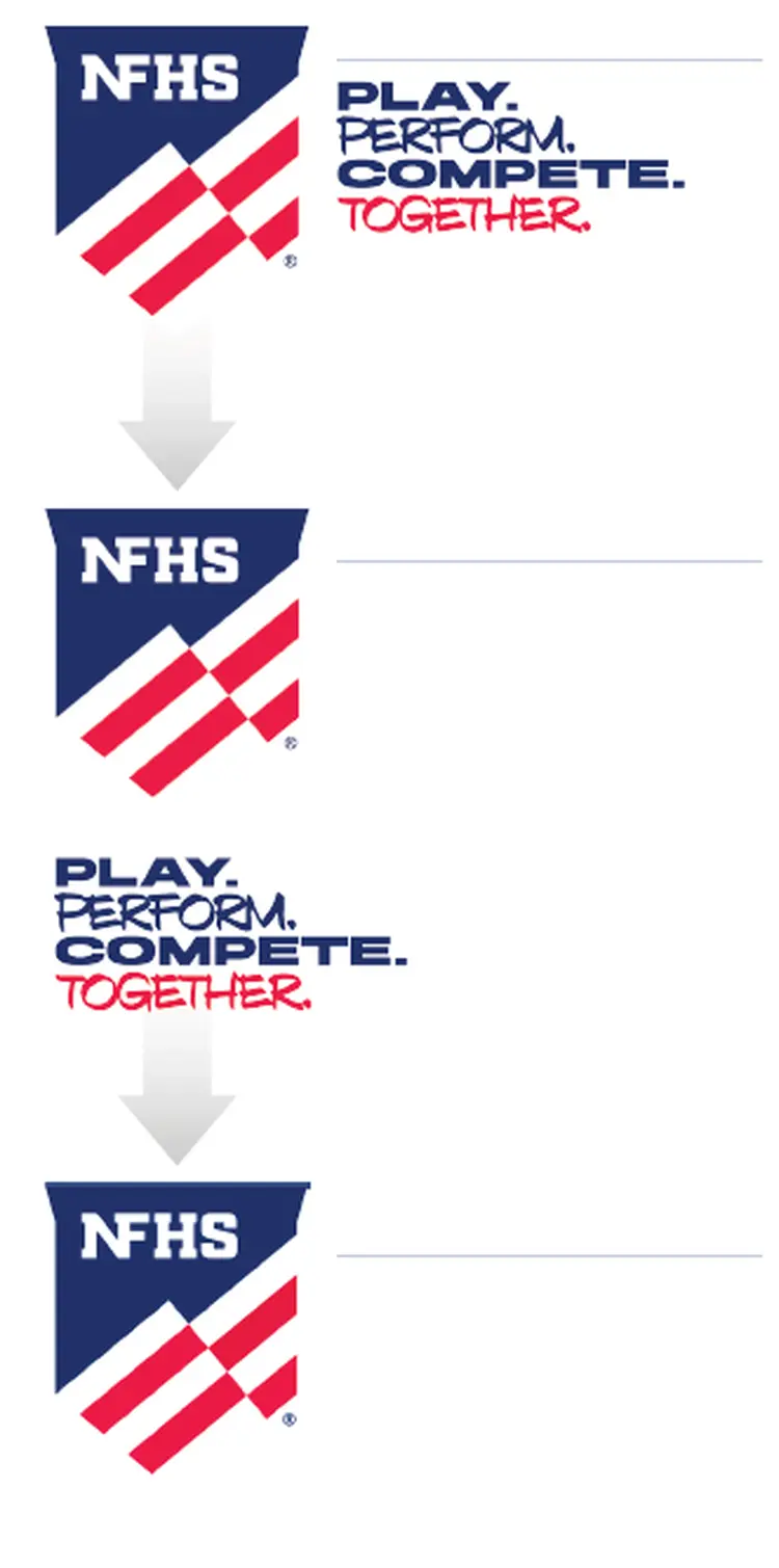
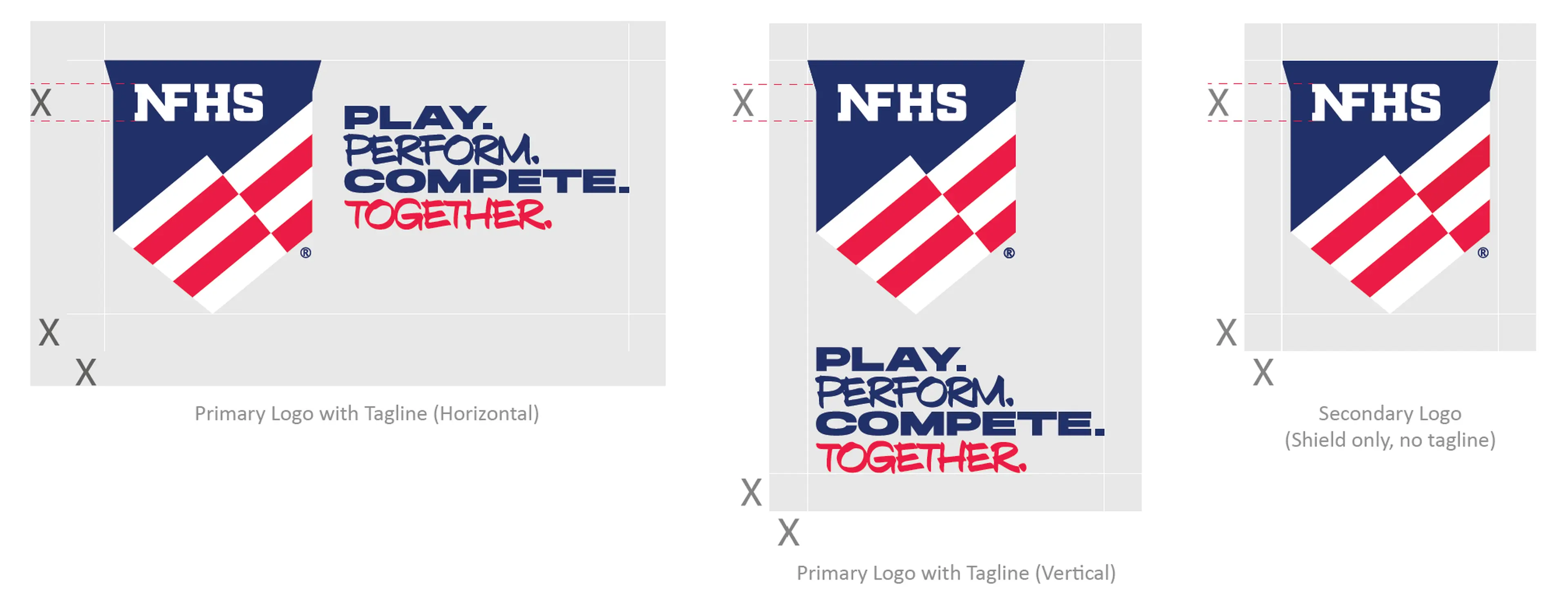
There are three versions of the NFHS logo. When using the logo, they should be considered in the following order:
This version is the primary version and should always be considered first.
l l l l
This version is available for unique cases where the horizontal version does not fit.
l l l l
This version is only to be used in very unique circumstances where space is at a premium, on letterhead, contracts and legal documents, or when other campaigns or brands are also appearing.
PRIMARY LOGO WITH TAGLINE (HORIZONTAL)
The Primary Logo with tagline should be used all applications when possible.
Full color with white text: To only be used when placed over brand blue. Download: PNG -- VECTOR
One color, white: To be used when placed over any color or background that is not white or the brand blue. Download: PNG -- VECTOR
One color, black: To be used only when 1-color printing is an option. Download: PNG -- JPEG -- VECTOR
Minimum Size Requirements: For Screens - 30 px For Print - 0.43 in/11 mm
Clear space
Area of isolation/white space.
Maintain sufficient white space around the logo for legibility and prominence. Use the height of the NFHS letters as a measuring tool for proper clearance.
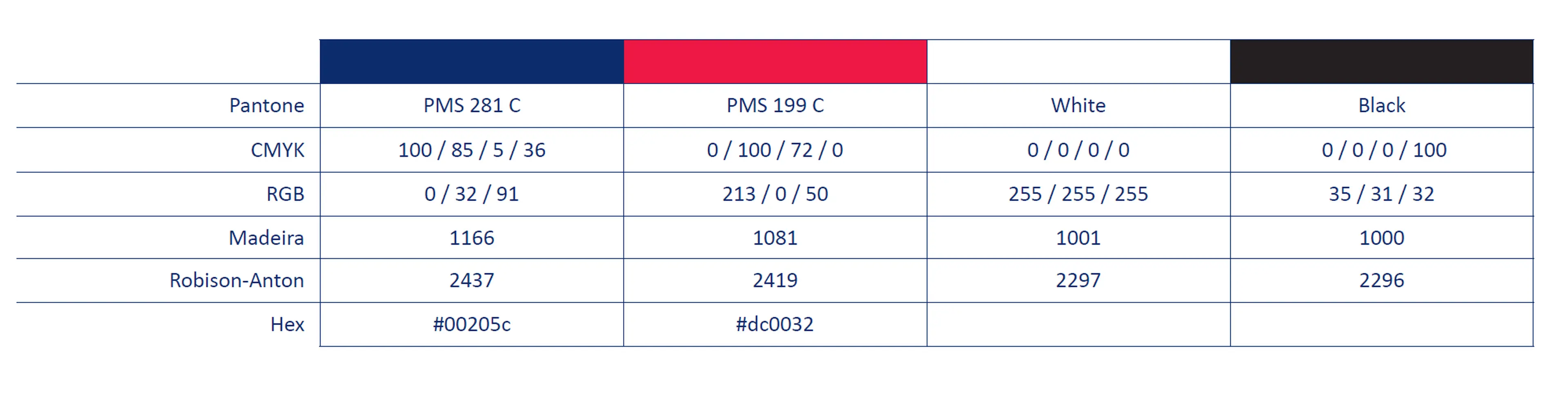
COLORS
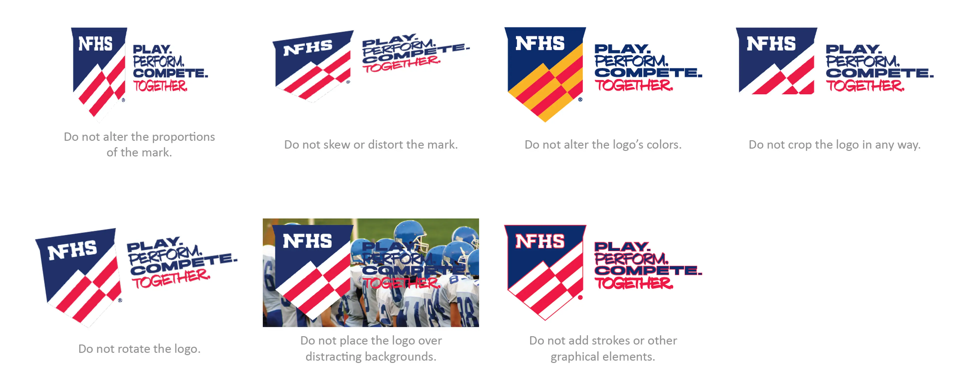
common misuse
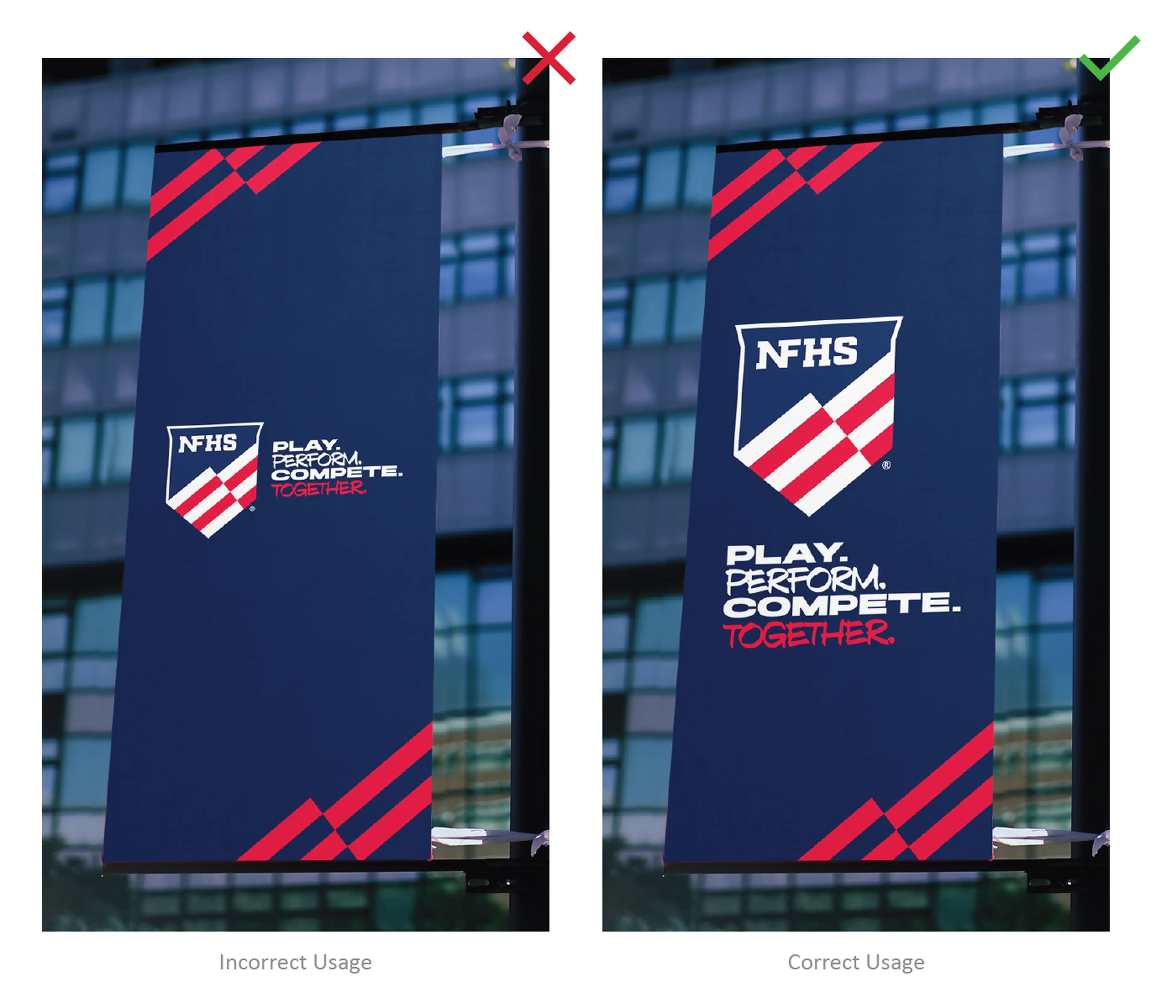
It is important to be mindful of which version of the NFHS logo to use depending on your application. Per the example (left), when the Primary Logo with Tagline (Horizontal) is applied on a vertical holding shape, the logo loses readability and becomes too small to use effectively.